
As a student, I dreamed of the day that I'd be talented enough to participate in Make-A-Mark, a design marathon for charity. Last year, that dream came true! Two other designers and I were assigned Bikemore, a charity in Baltimore that focuses on making the streets safer for all travelers from bikers to walkers.
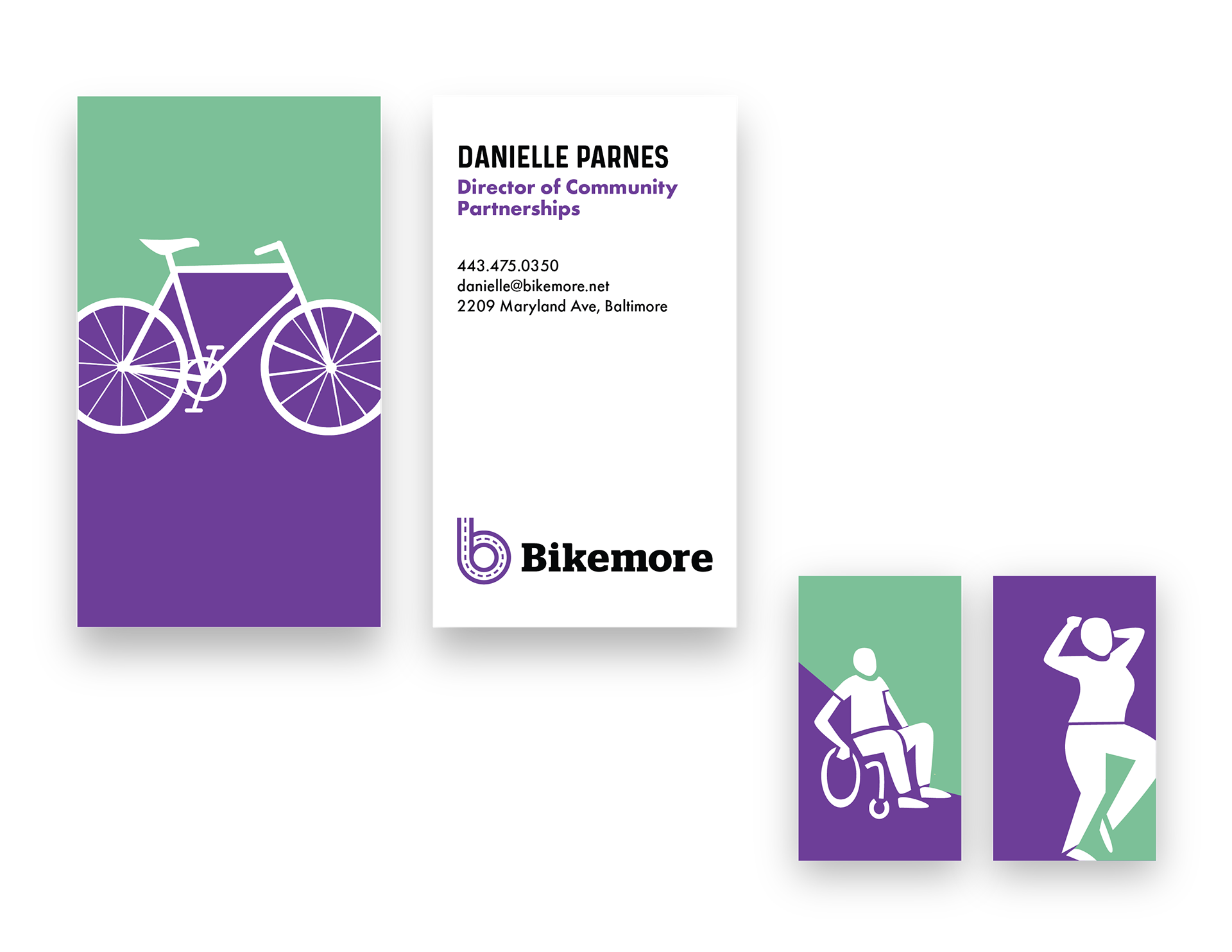
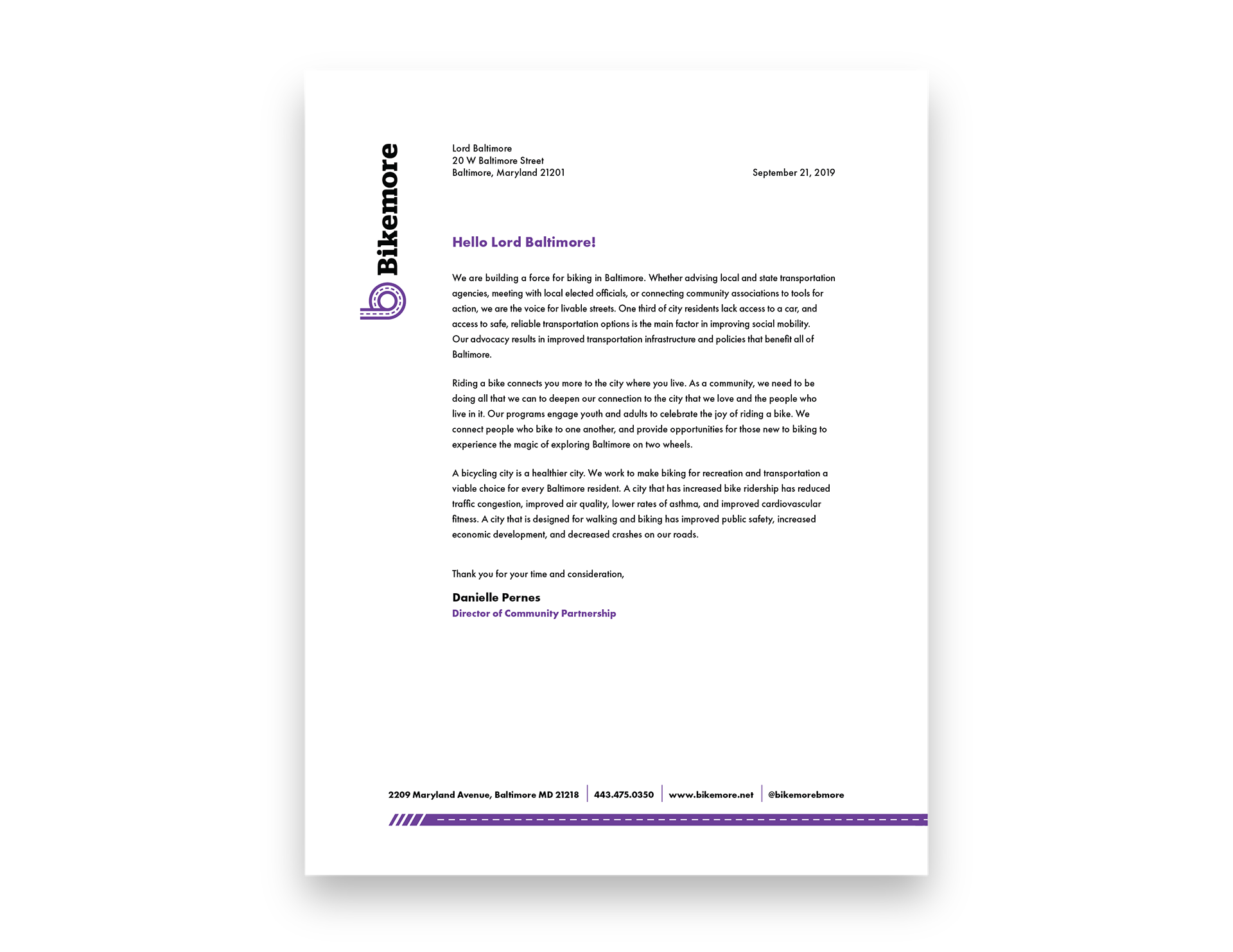
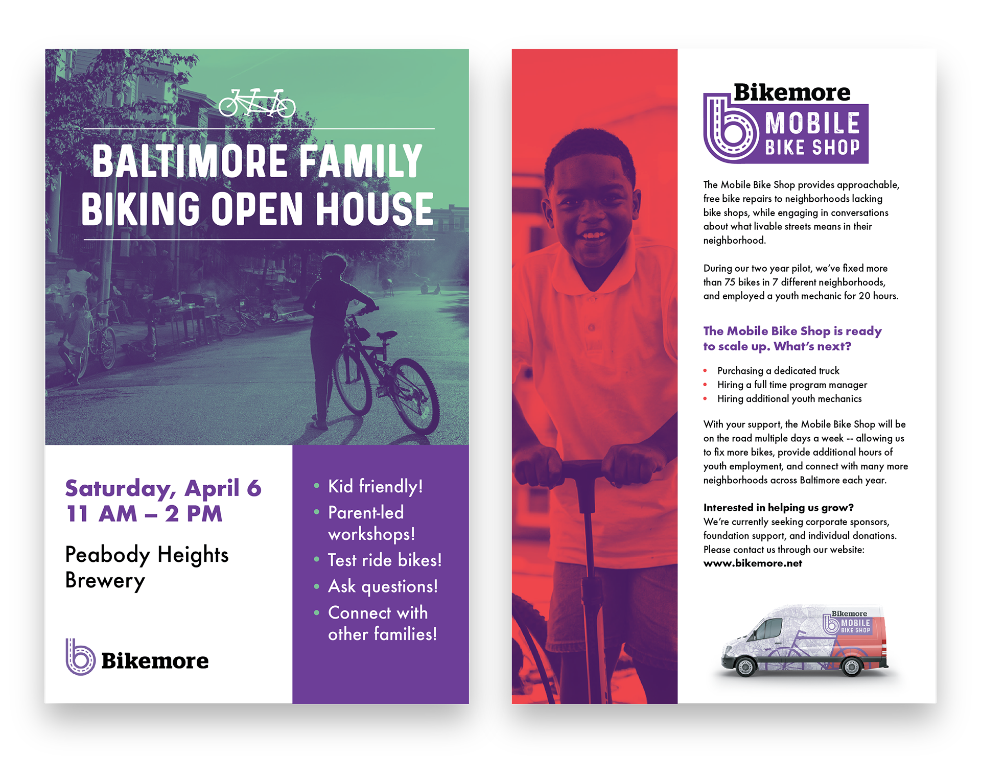
Our assignment was to use their current materials to establish a cohesive brand. They had a really inspiring pamphlet already designed that utilized super cool paper-cut illustrations, teal and purple colors, and Futura and Prequel typefaces. We took this pamphlet as the source of truth and pushed it further to create all of the brand materials.
What we presented back to to them was a style guide, business cards, a letter head, gradient filter template for photos, flyers, and a logo and skin for their Bikemore Mobile Bike Shop. My responsibility was the business cards, letter head, and flyers below!